Device Colours
Use without photography
The brand device can be used in a selection of different colour combinations using our primary and secondary brand colours. The device elements must only be used in these colour combinations.
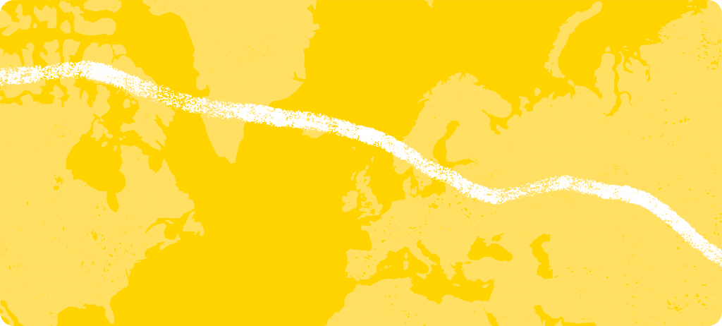
Combo 1
Used across all comms, mainly for large sections of colour/interest.
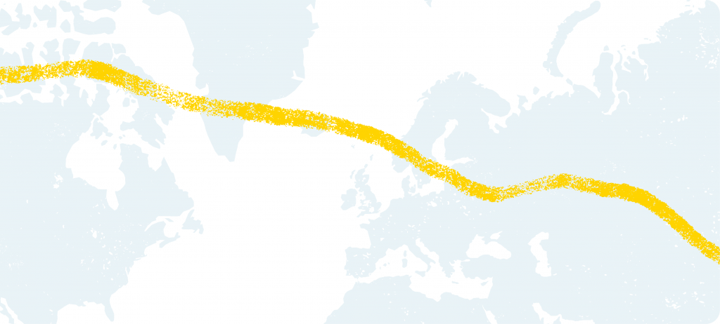
Combo 2
Good for corporate comms, digital and where a design has a lot of white space.
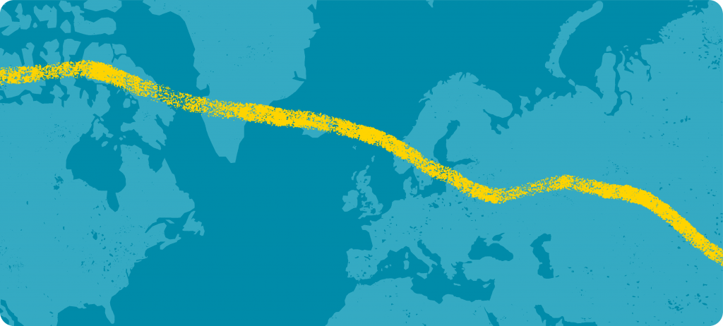
Combo 3
An alternative to the yellow background should only be used where the yellow has already been seen/used within a piece of comms. Should never be used alone.
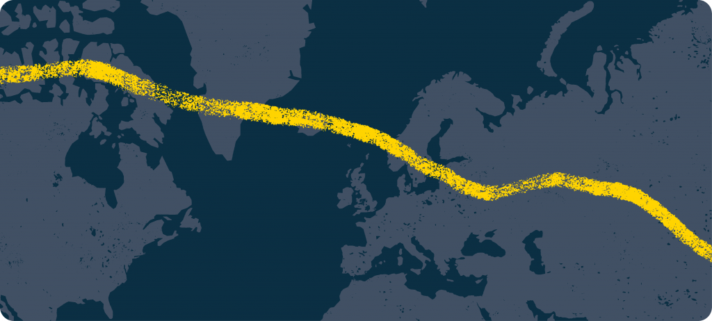
Combo 4
Good for secondary pages, back pages, web footers etc.
Use with photography
When the brand device is used with photography there are only two colour combinations that can be used. Combo 01 and Combo 02. The device elements can be placed over the imagery or use cut-outs to interact with the subjects of the photography as shown below.
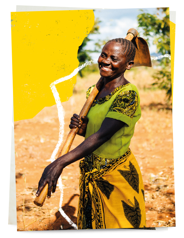
Photography with Combo 01
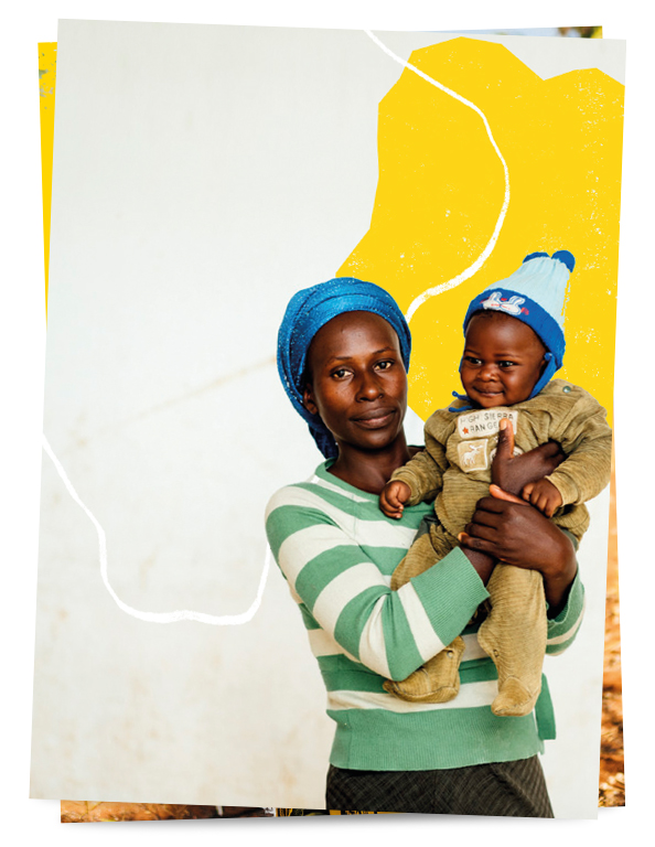
Photography with Combo 02
Where to use them
Primary pages should always use Combo 1 or Combo 2.
Combo 3 is an additional primary option which will come in to play for Tearfund Australia but might also be useful for secondary pages too.
Combo 4 should only be used on secondary pages.
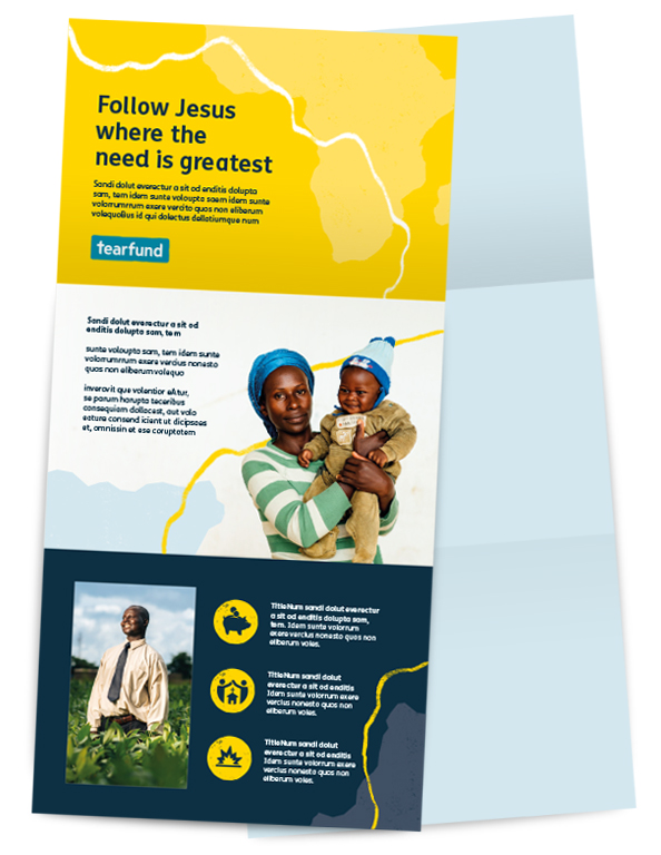
Multi-page item/booklet example. Primary page must only use the primary colour combination. Secondary/Internal pages can start to use secondary colour combinations.
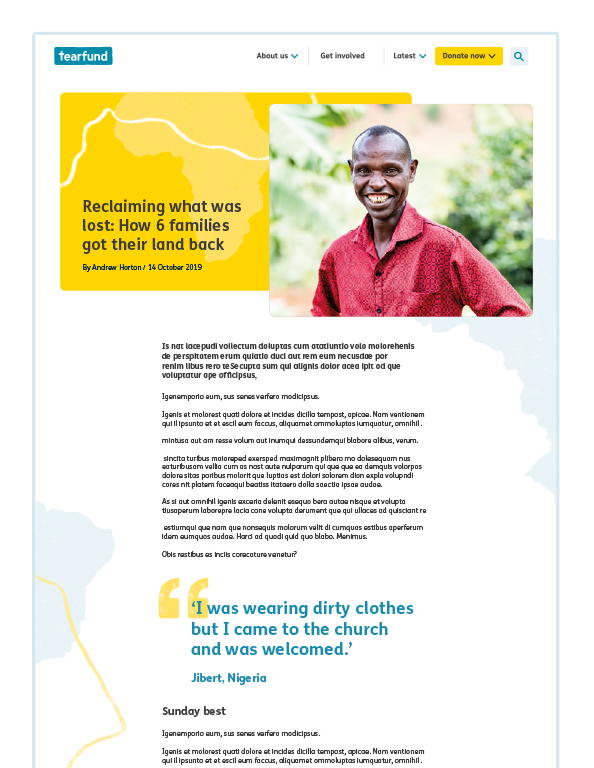
Digital example. Primary page must start with our primary colour combination, and then secondary combinations can be used as you scroll through.